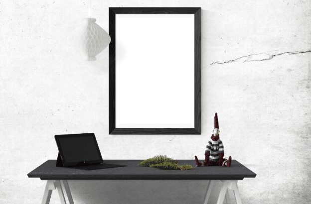
While a company’s offices should always be functional and professional-looking, many organizations make the mistake of overemphasizing this aspect of workplace design and failing to recognize the value of thoughtful decorating. Aesthetic elements such as artwork and other decorative items don’t just make an office look pretty; they transform sterile workspaces into engaging and dynamic environments that employees actively enjoy being in. A visually appealing workplace can boost creativity, reduce stress, and improve overall job satisfaction—all while making a much better impression on clients and other partners who come to visit.
Introducing a gallery wall into your office is an excellent way to enhance its visual appeal and strike the perfect balance between personality and professionalism. It’s a strategic move for any business that maintains a physical office, as it showcases creativity and attention to detail—qualities that reflect positively on the company’s brand. A thoughtfully curated gallery wall can serve as a conversation starter, foster a sense of community in the workplace, and visually communicate the values and culture of your organization.
Try these top decorating tips for building the perfect gallery wall at work:
Choose a Cohesive Theme
You can create a unified and harmonious gallery wall by building it around a theme that reflects your office’s identity. Consider what inspires your team and aligns with your company’s values. For instance, if your business is in the tech industry, you might opt for a theme featuring innovative technology or abstract digital art. If you’re in a more creative field, such as design or advertising, a mix of contemporary art prints and inspirational quotes could be more appropriate. The key is to choose a theme that resonates with your brand and creates a cohesive visual narrative.
Opt for a Unified Color Palette
A consistent color palette can tie the different pieces of your gallery wall together for a more polished, professional look. It will help your gallery wall integrate seamlessly into the office environment and enhance the space rather than overwhelm it. Start by examining the existing colors in your office decor, including wall paint, furniture, and other accessories. Then, choose a color scheme that complements these elements while also allowing the artwork to stand out. Neutral tones, such as greys, whites, and beiges, are always a safe bet and can be accented with bolder colors to add visual interest.
Select Appropriate Frames
The frames you choose influence the overall aesthetic of your gallery wall just as much as the art itself. Opt for frames that are simple and elegant, such as black, white, or metallic options. These choices are versatile and can complement various styles of artwork. Consider the style of the frames in relation to the artwork, too—minimalist frames work well with modern art, while more ornate frames might suit traditional pieces. A consistent frame style can also help to unify the gallery wall and make it look well-curated and cohesive. Lastly, make sure to invest in good quality frames. This will reflect the professionalism of your office in addition to enhancing its visual appeal.
Pre-Plan the Layout
Before you start hanging anything on your office’s wall, plan the layout meticulously to ensure a balanced, visually pleasing final result. Pre-planning helps you see how the pieces interact with each other and allows you to make adjustments before committing to nails and hooks. Start by laying out your pieces on the floor to experiment with different arrangements. Also, consider using templates or painter’s tape on the wall to mark where each piece will go. Aim for a balanced layout with a continuous flow and avoid any areas that feel too cluttered or too sparse.
Change Up Sizes and Orientations
Varying the sizes and orientations of your artwork can add depth and interest to your gallery wall. Mix different sizes—large, medium, and small—to create a dynamic look that draws the eye. Also, keep the arrangement engaging by including both portrait and landscape orientations. However, it’s equally important to maintain balance in the overall composition. Ensure that the different sizes and orientations are distributed evenly across the wall to prevent any section from appearing too heavy or too light.
Incorporate Branding Elements
If you want your gallery wall to reinforce your company’s identity without being too overt, then working in some subtle branding elements can do the trick. You might achieve this by using brand colors, logos, or even custom artwork that reflects your business’s mission and values. These touches will take your gallery wall from being a mere decorative element of your office space and turn it into a vehicle for communicating your brand’s story and values.
Update the Wall Regularly
Your office will likely change over time and your gallery wall therefore needs to change with it to keep the overall work environment dynamic and fresh. Regular updates to your decor can reflect new projects, company achievements, or seasonal changes. This keeps the space visually appealing and demonstrates that your business is active and evolving. Schedule periodic reviews of the gallery wall to decide which pieces to keep, rotate, or replace. You might also want to encourage employee contributions, as these can add a personal touch and foster a sense of community within the office.
A well-executed gallery wall can transform an ordinary office into an inspiring and visually stimulating environment. Thoughtfully arranging your chosen art pieces will enable you to create a space that embodies everything that makes your company truly special. Take the plunge and start curating your gallery wall, and watch as it boosts morale, impresses clients and leaves a lasting positive impact on your workplace.

